
Penny's Rebrand.
A bold new brand for bold Nashville flavor.



ROLE
Brand Designer
Brand Strategist
COLLABORATORS
Ibrahim Ma (me!)
DURATION
1 month
SKILLS
Brand Identity
Competitor Research
Visual Storytelling
Graphic Design
↑
OVERVIEW
What if we could redesign an existing brand to stand out in a crowded market?
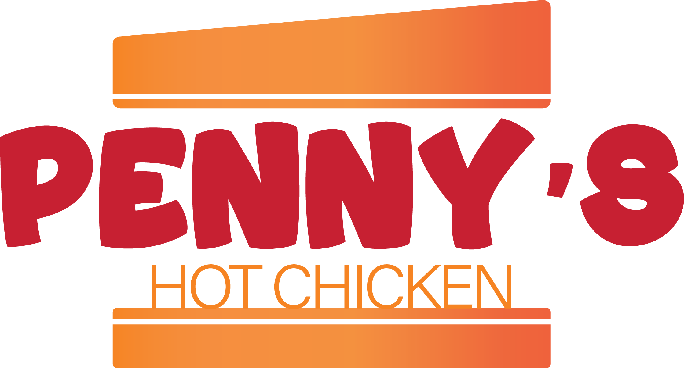
Penny’s Hot Chicken targets students and young adults, but its branding felt disconnected from the experience and quality of its food.
Old Logo
SOLUTION
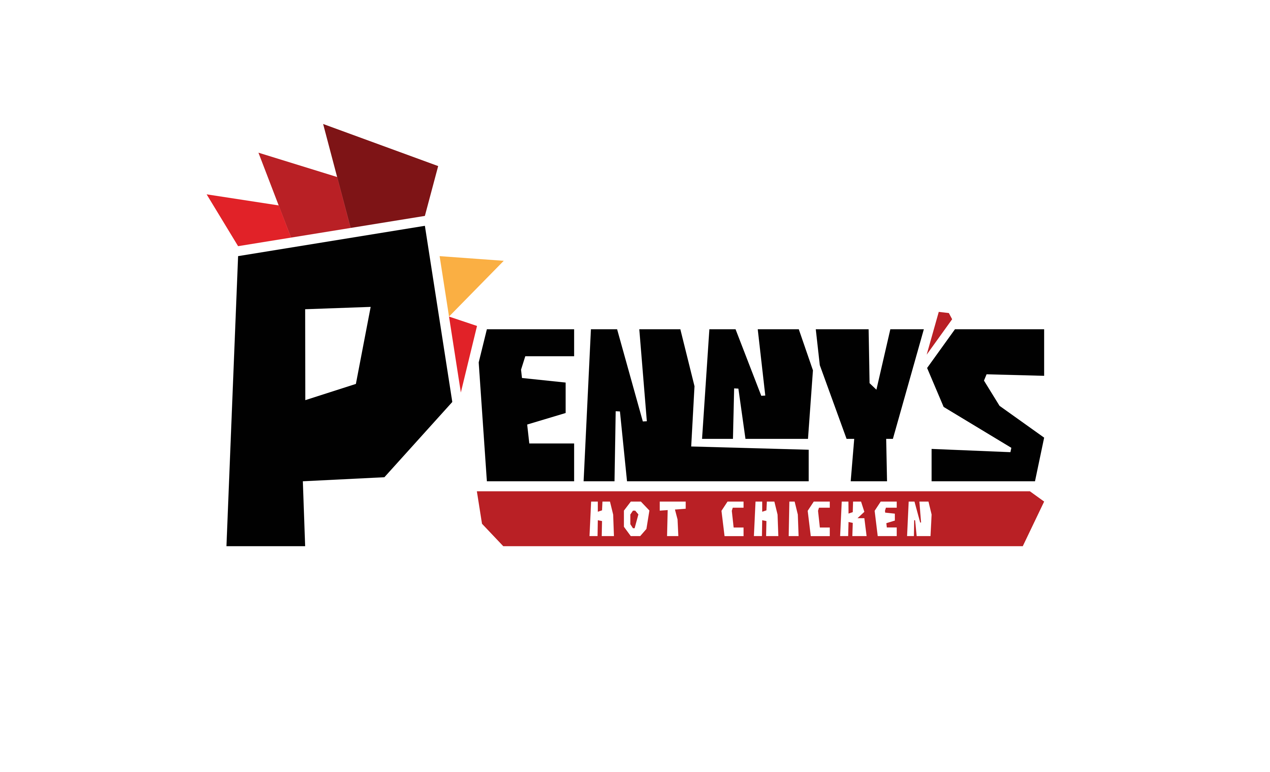
A rebrand designed to make the brand feel as bold as the food itself.

New logo.
New graphics.
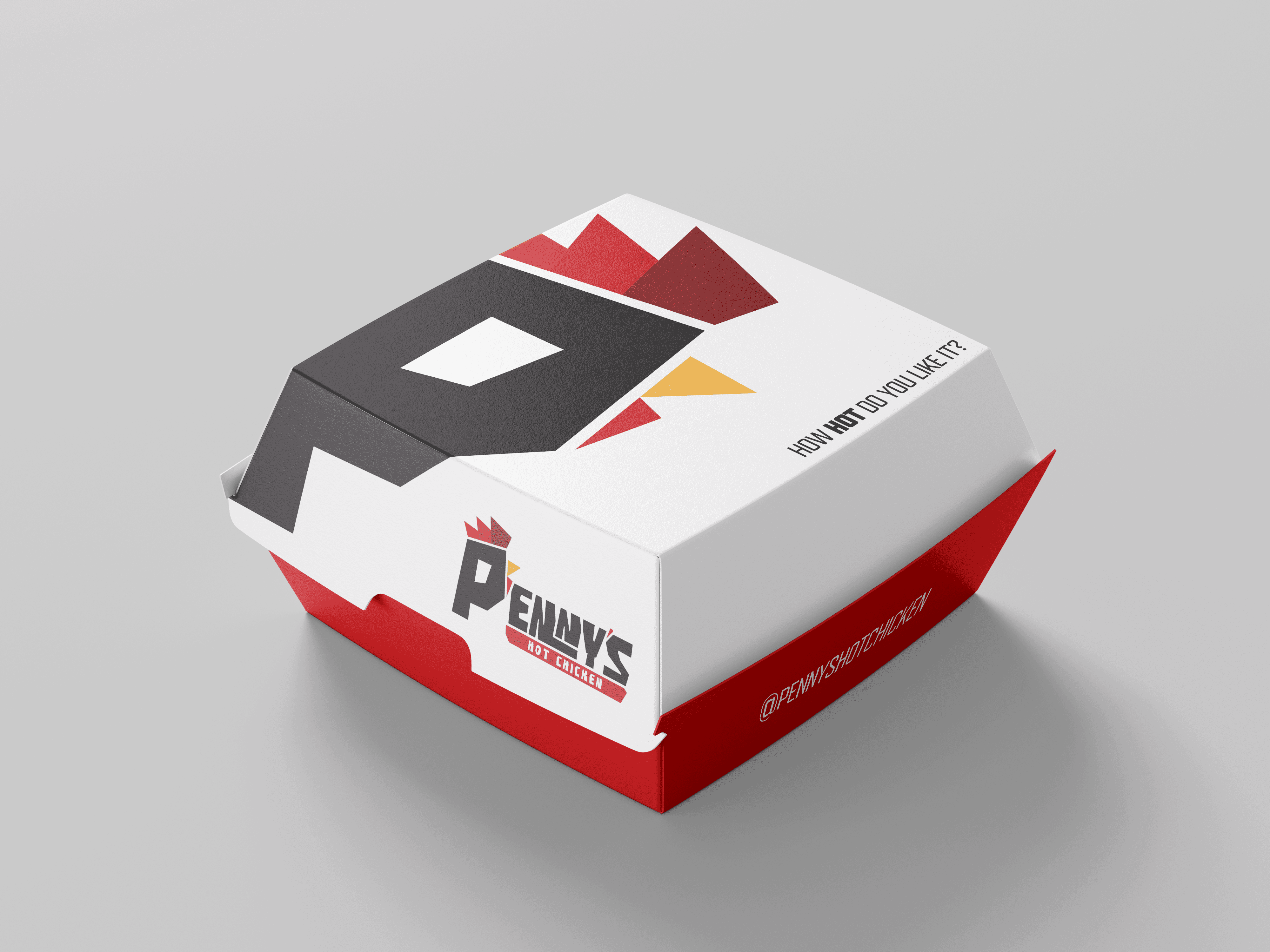
Redesigned packaging.

Social media marketing strategy.
CURRENT ISSUE
The existing brand didn't match the quality of their food.
The existing identity lacked personality and memorability, making it difficult to stand out in an increasingly competitive fast-food market. The visual identity failed to communicate the bold, energetic experience that defines Nashville hot chicken.
INTERIOR


EXTERIOR


BRANDING


COMPETITOR ANALYSIS
Successful brands were selling an experience, not just chicken.
Dave's Hot Chicken built an identity around its origin story, bold street-inspired visuals, memorable mascot, and strong social media presence.


Instead of copying those aesthetics, I focused on understanding why they resonated with younger audiences and what Penny's was missing.
CHALLENGES
Research revealed 3 core issues on Penny's…
To help guide the direction of the new rebrand, I identified 3 main issues of the existing brand.
Cheap identity
typography resembled a toy brand.
Lacked voice
Every platform communicated differently.
Inconsistent branding
Packaging felt visually disconnected from the logo,
DESIGN PROCESS
Designing a brand that felt as bold as it's food.
My main focus was to make this new rebrand memorable. Since their existing brand was reinforced with different spice levels, I wanted every change to support the feeling of spice.
Picking typography.
I chose a bold, slightly erratic typeface to give the brand a confident, energetic personality that reflects the intensity of its food.

The brand also needed a secondary typeface for supporting content and improved readability. I chose a more structured, symmetrical font that complements the bold personality of the primary type while remaining easy to read.

Choosing a color system.
I kept the warm colors from the original brand but refined the palette to feel more cohesive and premium.

Logo concept.
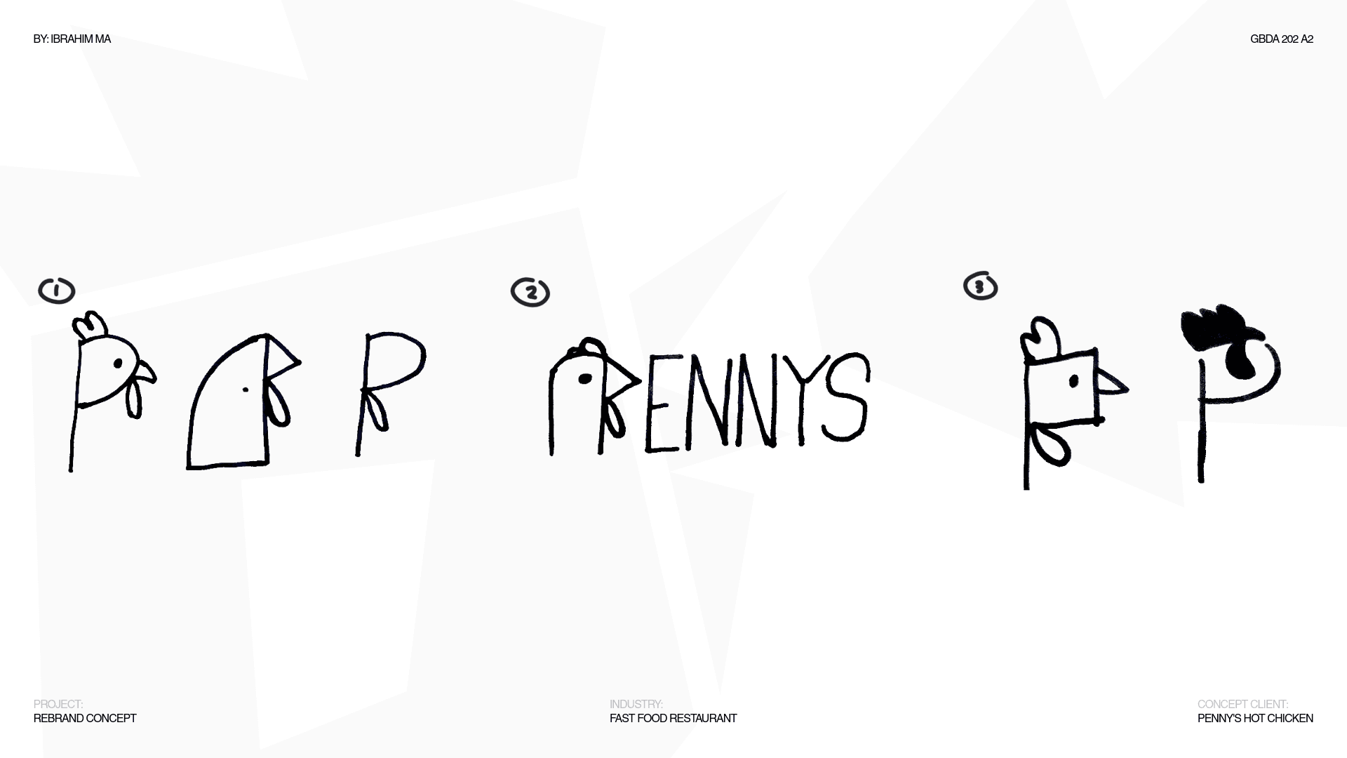
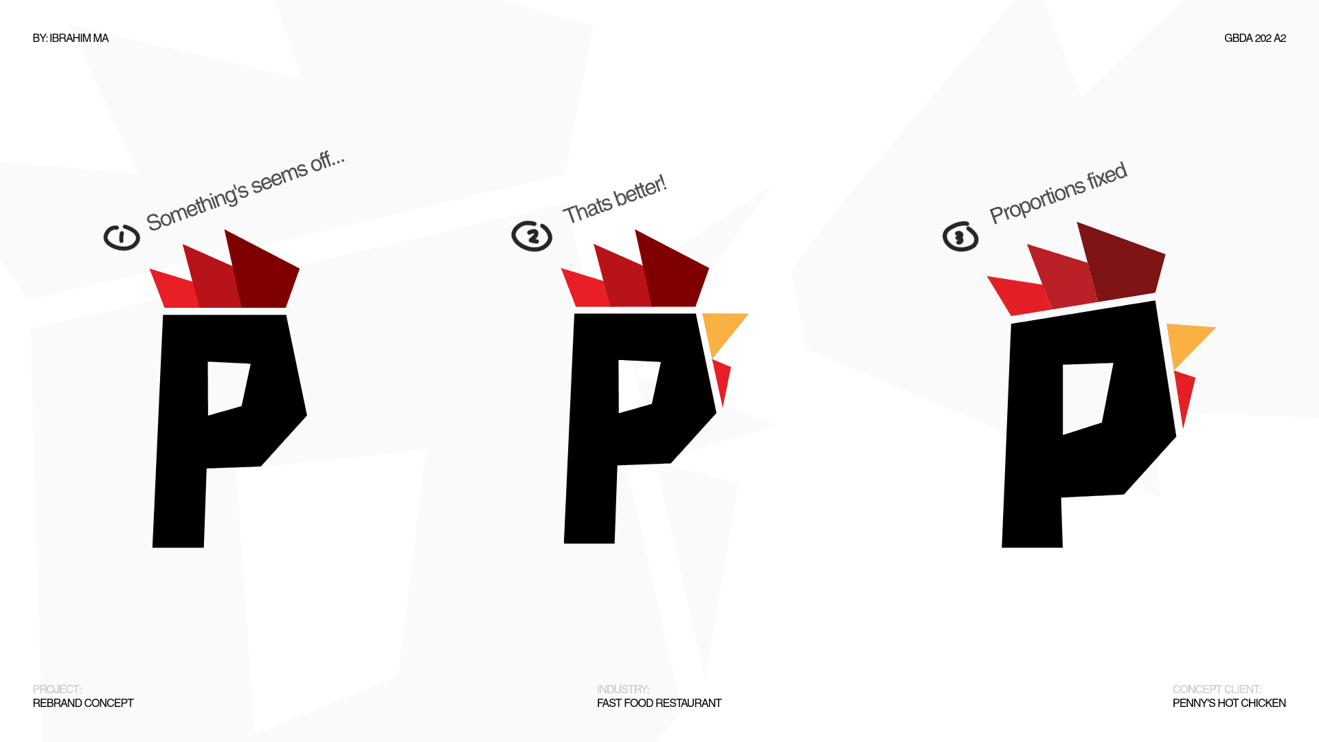
For the new logo, I wanted to encorporate universal features of a chicken with the letter P to create a chicken head.

Once I figured out the general direction, I started experimenting with sketches…



MARKETING STRATEGY
Penny's social media exposure was poor…
Competitors like Dave's Hot Chicken also built their brand around Partnerships and UGC content. Penny's had none of that, hence their low follower count.
DAVE'S HOT CHICKEN
2.4 MILLION FOLLOWERS
OFFICIAL UFC PARTNER
UGC CONTENT

PENNY'S HOT CHICKEN
2000+ FOLLOWERS

A new content marketing strategy.
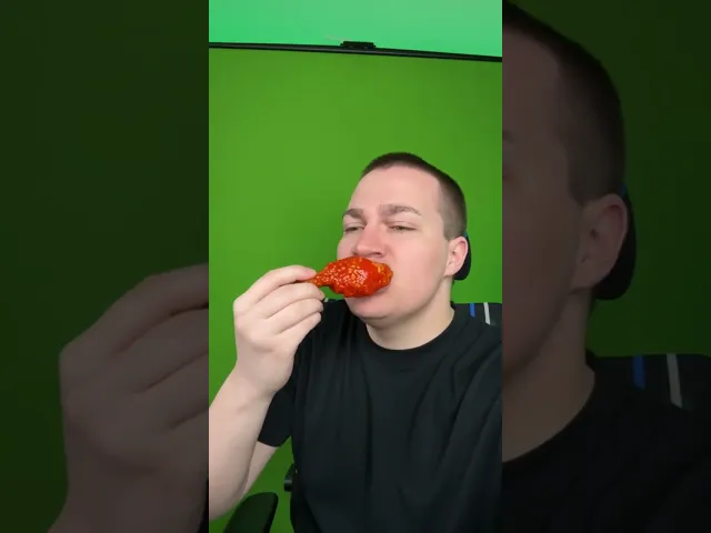
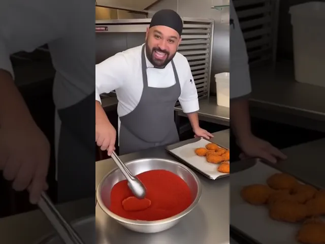
The new Penny's social media page will consist of UGC, behind the scenes, and following social media trends. These video's better align with the brands target audience while making the restaurant feel more authentic, engaging, and relatable.
UGC content
2.1M views
Behind the Scenes
208K views
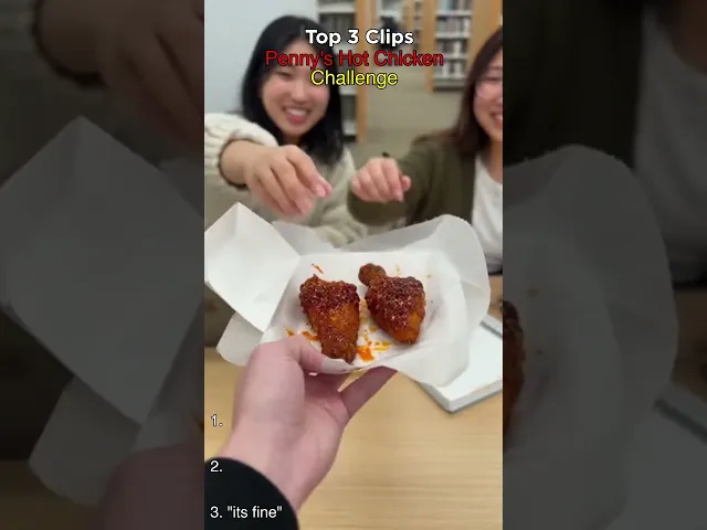
Social Media Trends
6.2M views
FINAL SOLUTION
A new brand that stands out in a competitive market.
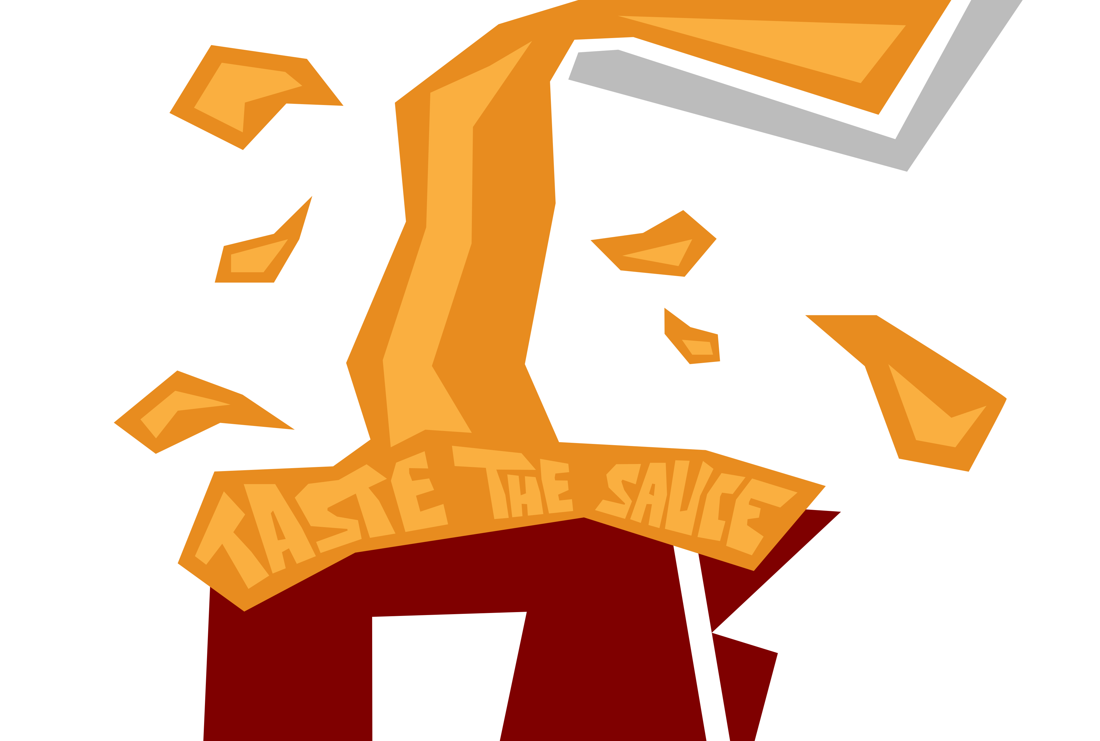
To top off the new brand, I created reusable graphics in the style of their logo. These assets can be applied across social media posts, restaurant interiors, merch, food packaging, and future marketing, all creating a cohesive brand system that extends beyond the logo.



Like what you see?
Let’s work together.
izma@uwaterloo.ca

Ibrahim Ma
©
2026 All rights reserved